| Back to show catalogue | ||
|
Monogolds - Ruth Mitchell
The production of the booklet Yves: Peintures in 1954 is viewed the first real indication of Klein's preoccupation with the monochrome. Although none of the works actually existed , Klein ever the master of self-promotion, had set out to establish himself and the monochrome in the art world. This audacious move on his part was as Stitch observes proof of his belief in the ëidea' of monochrome painting. Monochromes, as a form of conceptual art which shuns line and colour as meaningful pictorial tools, were a logical progression given the artistic environment of the day. Duchamp had already exhibited his readymades which questioned the traditional views of art, art making and the belief that the hand of the artist must be evident in the creative act. "Rejecting the view that art had to have a personalized touch and handmade appearance that appealed to the eye, Duchamp fetishized the commonplace and placed art in the service of the mind." (Stich, p. 47) The ground had been prepared and Klein did not lack for ego, conviction or imagination. Although the first attempt to exhibit an orange monochrome in 1955, was thwarted his determination was not. Already he was exploring the emotive qualities and sensual nature of colour as "materialized sensibility" and lamented the purity of colour in powdered pigments that was lost when mixed with other mediums. Colour presented in it's purest form and without direct reference to the material world was one of the basic tenants of his ideology. It was this obsession with the elemental qualities of colour which inspired much of his artistic endeavours. By 1956 he had settled on the colour blue after serious experimentation in all the primary colours. His idea was to inspire the viewer to pass beyond the restrictions of proscribed meaning and allow for a variety of interpretations and Klein felt that blue was the key. It was the colour "without dimensions" which "at the very most recalls the sea and the sky which are the most abstract aspects of tangible and visible nature." (Stich, p. 78) The appearance of gold in his work was entirely in keeping with his desire to retain the purity of the colour. He was concurrently working on red monochromes and the triad of primary colours was re-established although the yellow had been transformed to gold which was already well on it's way to securing a memorable position in Klein's work. Just prior to the introduction of the monogolds Klein had been selling his Zones of Immaterial Sensibility in exchange for gold bars. Although Klein insisted that one half of the gold be thrown into the river as part of the purchase ritual there is a odd juxtaposition between the obvious materiality of gold and his long standing fascination with immateriality.
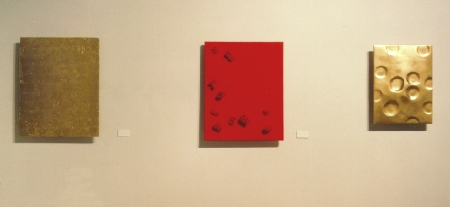
American Robert Rauschenberg had produced a series of Elemental Paintings earlier in the decade but had used gold leaf as a part of his artistic exploration of the physical nature of materials, often using combinations of elements. For Rauschenberg the use of gold was no more ëspecial' than paint, both were merely material with which one could produce art. The gold leaf in these works was usually layered over paper, paint and fabric creating roughly textured and complex surfaces. Rauschenbberg's Gold Paintings were an integral part of a body of work that also included his Elemental Sculptures made from stone, wood and clay which were three dimensional collections of earthly substances. By comparison, Kleins surfaces are controlled and meditative. Unlike Rauschenberg, Klein was intrigued by the ancient myths and history surrounding gold as the supreme metal. It had not escaped his attention that the transformation of base metals to gold had been the ultimate goal of the early alchemists using the philosophers stone. This link between gold and the ancient philosophers stone held magic for Klein and he viewed his works in gold as signifiers of the connection between the artistic process and the goal of art to inspire the viewer to "discover the gift that is the philosophers stone that exists in each of us".(Stich, p 193) The Monogolds are beautiful expanses of gold leaf applied to wood or in most cases to plaster or canvas over wood. The prohibitive expense aside, attaching the gold leaf to the various ground was problematic. In his Untitled monongolds of 1960 there is an obvious repeating geometric grid which is the shape of the gold leaf applied. On some works the leaves are only partially attached "so that the paintings have a pronounced aerial, ephemeral quality." (Stich, p 194) On others there are circular shapes similar to wax seals that are most likely melted gold that Klein used to fix the gold leaf to the canvas or wood. The monogold panel entitled Resonance, 1960 was created using plaster layered over wood. The surface appears to be undulating and is broken by round, smooth depressions. The entire surface is covered in gold and the light and shadows play in the hollows. In contrast the Untitled Monogolds are canvas over wood with the gold leaf squares meticulously applied. The result is a geometric grid that is scattered with raised circular drops of melted gold. The occasional canvas is gold squares applied over the trademark Klein blue which has been subsequently scraped away. It is as if by showing what is hidden on the underside of the gold Klein reveals himself and his art as transformed into the supreme icon of the art world.
Gold was also planned as an integral part of his unrealized relief project. His plan was to make head to knee body casts of himself and his friends in the manner of early Greek and Roman statues. "The casts would all be colored I.K.B. and set against a gold panel, except for one portrait - that of the artist himself - which would be gold against a blue ground." (Stich p 143) It is not without good reason that this idea could be construed as Klein's attempt to have himself immortalized as the artist who had transcended the material art world and reigned supreme.
Sources Robert Rauschenberg: A retrospective : New York: Guggenheim Museum Publications, 1997 Stich, Sidra
Yves
Klein. New York: Cantz Verlag, 1995
|
||
 The
subtle shift from the exhaustive exploration of the blue monochromes to
the monogolds and monopinks in 1959 is not surprising when viewed within
the oeuvre of Klein's career. From the outset he had been attracted
to the primary colours. The early monochromes had been rendered in various
shades which quickly reduced themselves to red, blue and yellow before
he settled on a particular shade of blue. When the primary colours reappeared
in his work the yellow had shifted to gold.
The
subtle shift from the exhaustive exploration of the blue monochromes to
the monogolds and monopinks in 1959 is not surprising when viewed within
the oeuvre of Klein's career. From the outset he had been attracted
to the primary colours. The early monochromes had been rendered in various
shades which quickly reduced themselves to red, blue and yellow before
he settled on a particular shade of blue. When the primary colours reappeared
in his work the yellow had shifted to gold.
 This
duality is played out in his monogold works. Klein saw gold as
"a timeless, universal signifier of purity and plentitude that had a value
which transcended material considerations." (Stich, p 193) Although not
unaware of the material attributes of gold he sought to use it as
a way of furthering his artistic ideas around immateriality and pictorial
ans material sensibility. Klein was searching to reaffirm and re-present
the transformative qualities that colour held for him and used gold to
indicate that power.
This
duality is played out in his monogold works. Klein saw gold as
"a timeless, universal signifier of purity and plentitude that had a value
which transcended material considerations." (Stich, p 193) Although not
unaware of the material attributes of gold he sought to use it as
a way of furthering his artistic ideas around immateriality and pictorial
ans material sensibility. Klein was searching to reaffirm and re-present
the transformative qualities that colour held for him and used gold to
indicate that power.
 Klein's
use of gold was not restricted to the monogold panels. He created several
gold sponge reliefs and one each of a gold sponge sculpture and gold obelisk
sculpture. As well, in 1961 he designed and constructed a votive offering
to Saint Rita. The top of the box was comprised of three compartments
in which Klein placed gold leaf and powdered rose and blue pigments as
well as gold bars in the lower section. The emphasis that Klein places
on these three elements at the zenith of his career is very telling of
the significance they held for him.
Klein's
use of gold was not restricted to the monogold panels. He created several
gold sponge reliefs and one each of a gold sponge sculpture and gold obelisk
sculpture. As well, in 1961 he designed and constructed a votive offering
to Saint Rita. The top of the box was comprised of three compartments
in which Klein placed gold leaf and powdered rose and blue pigments as
well as gold bars in the lower section. The emphasis that Klein places
on these three elements at the zenith of his career is very telling of
the significance they held for him.